


Colour is often treated as a finishing decision. In sports environments, it should be treated as a performance decision.
The colours used across a stadium, arena, training ground or hospitality suite can influence how people feel, move, spend time and connect with a club. For athletes, colour can support focus, calm, energy or psychological readiness. For fans, it can strengthen identity, improve atmosphere and shape the way a venue is remembered.
For clubs, venue operators and commercial teams, this makes colour more than an aesthetic preference. It is part of the supporter journey, the premium experience and the operational reality of live sport – ultimately influencing your final stadium revenue.
Why Does Colour Psychology Matter in Sports Venue Design?
Colour psychology looks at how different hues influence emotion, perception and behaviour. In sport, those responses matter because venues are high-pressure, high-emotion environments.
A changing room, recovery suite, tunnel, concourse, premium lounge and fan zone should not all feel the same. Each has a different purpose. Each asks something different of the people using it.
A well-considered palette can help a space feel energising, calm, exclusive, welcoming or intense. Poor colour choices can create visual noise, dilute brand identity or make spaces feel disconnected from the club and the event. In recovery-led environments, such as the Leeds United Training Academy Spa, colour should work alongside lighting, materials and layout to support how the space needs to feel and function.
How Can Colour Influence Athlete Performance?
Colour will not replace coaching, preparation or elite facilities, but it can contribute to the psychological conditions around performance.
Can red create intensity?
Red is often associated with energy, urgency and dominance. In the right context, it can help create a sense of intensity, particularly in spaces designed for activation, motivation or pre-match focus.
It needs careful handling. Too much red can feel aggressive or visually exhausting, especially in rooms where athletes need clarity and control. Explore more research related to the colour red and its impact.
Can blue and green support recovery?
Blue and green are commonly linked with calm, balance and restoration. They can be particularly useful in recovery rooms, treatment spaces, wellness areas and athlete lounges where the design goal is to lower stimulation and support reset.
In these environments, colour should work with lighting, materiality, acoustics and layout. A calm palette alone is not enough, but it can reinforce the intended state of the space.
Why does context change the effect of colour?
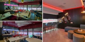
The same colour can perform differently depending on where it is used. A bold red in a players’ tunnel can create drama and anticipation. A deeper red in a premium lounge might feel rich and atmospheric. A bright red across a whole concourse may create fatigue.
This is why sports venue colour strategy should be developed by zone, not applied as a blanket treatment.
How Should Clubs Choose Colour Palettes for Sports Facilities?
The right palette starts with the purpose of the space. A changing room, recovery suite, concourse and hospitality lounge each need a different balance of energy, clarity, comfort and brand expression.
What should training environments consider?
Training spaces should support concentration and repeated use. The palette should avoid unnecessary visual clutter while still giving the environment energy and identity.
Colour can also assist wayfinding, zoning and behavioural cues, helping athletes, staff and visitors understand how the facility works.
What should recovery and wellness areas consider?
Recovery environments should feel composed and controlled. Softer blues, greens, neutrals and natural tones can support a more restorative atmosphere, particularly when paired with comfortable finishes and appropriate lighting.
The design should help athletes transition away from performance intensity into reset and rehabilitation.
What should hospitality spaces consider?
Hospitality design is not just about premium finishes. It is about how people feel in the space, how naturally they settle into it and whether the experience feels distinctive enough to justify the commercial proposition.
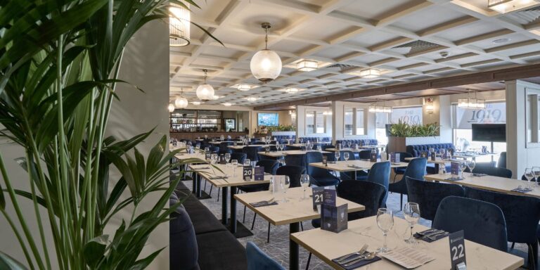
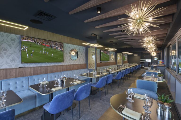
Colour can influence premium perception, social energy and brand immersion. A strong palette can make lounges, suites and restaurants feel more memorable without becoming themed or heavy-handed.

How Can Club Colours Strengthen Fan Connection?
Club colours carry history, memory and belonging. They are part of how supporters recognise themselves in the built environment.
Used well, they can make a stadium or arena feel unmistakably connected to the club. Used poorly, they can become flat, repetitive or overly literal.
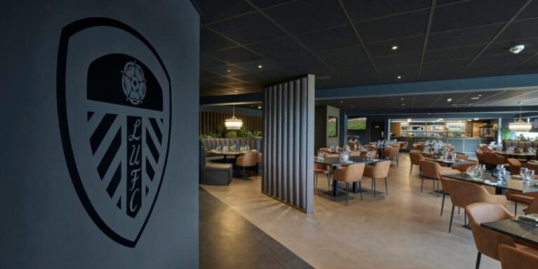
The strongest applications are often layered. Club colours may appear through accent walls, furniture, lighting, graphics, signage, materials or curated details rather than being applied uniformly across every surface.
This approach helps protect brand identity while allowing different parts of the venue to have their own atmosphere and commercial purpose.
How Does Colour Improve the Fan Experience?
Supporters do not experience colour in isolation. They experience it as part of a wider journey: arrival, orientation, queuing, socialising, purchasing, watching, celebrating and leaving.
A clear colour strategy can support that journey.
It can make navigation easier, give fan zones a stronger sense of energy and create visual moments that supporters remember and share. In premium areas, colour can also help signal the shift into a more elevated matchday experience.
For commercial teams, these details matter. Better environments can increase dwell time, improve satisfaction and support stronger attachment to the venue experience.
What Are the Current Trends in Sports Venue Colour Design?
Modern sports venue design is moving away from one-dimensional brand application. Clubs and operators are increasingly looking for palettes that feel more flexible, more premium and more specific to each area of the venue.
This might mean pairing traditional club colours with warmer neutrals, darker tones, metallic finishes, natural textures or digital lighting systems. The aim is not to dilute identity. It is to make it work harder across different environments.
Future-ready venues need colour systems that can flex across different audiences, event formats and commercial settings while still feeling coherent. Lighting, material choice and digital brand expression can help clubs adapt the atmosphere without losing identity.
How Can Sustainability Shape Colour Choices?
Colour decisions also have a material impact. Paints, coatings, fabrics, flooring and finishes all carry environmental considerations.
Low-VOC paints, durable materials, responsible sourcing and long-life finishes can reduce the need for frequent replacement while supporting healthier internal environments. This is particularly relevant in high-traffic venues where surfaces must withstand heavy use.
Sustainability should not be separated from design quality. A responsible colour and material strategy can still create impact, atmosphere and strong brand presence.
DT Sports: Using Colour to Enhance Stadium Performance
Colour should be considered as part of the wider performance of a sports environment, not as a final decorative layer. It influences how spaces feel, how people move through them and how strongly they connect with the club or venue.
The strongest colour strategies are built around purpose. A recovery suite, hospitality lounge, concourse, changing room and fan zone each need to support different behaviours, emotions and commercial outcomes.
For clubs and operators investing in stadiums, arenas, hospitality spaces and training environments, this makes colour a practical design tool. Used with intent, it can support athlete preparation, strengthen supporter identity, improve premium perception and create more memorable venue experiences.